Visual Communications in a mix with specific objectives
Graphic Design
THE OVAL PROJECT
Branding Project
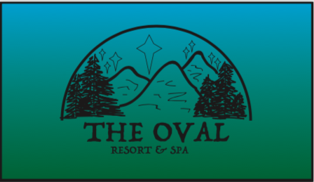
This was a project based on a random word generator. I picked a word ‘Oval’, which I then had to develop into a company. My first two ideas were Resort & Spa as well as Dentistry Clinic (you can see some logo sketches under my Drawing/Sketching Page).
The idea of this company is cool tones, snow on mountains, hot chocolate time for families with kids. Located in Eastern Europe, nearby Austria and Switzerland.
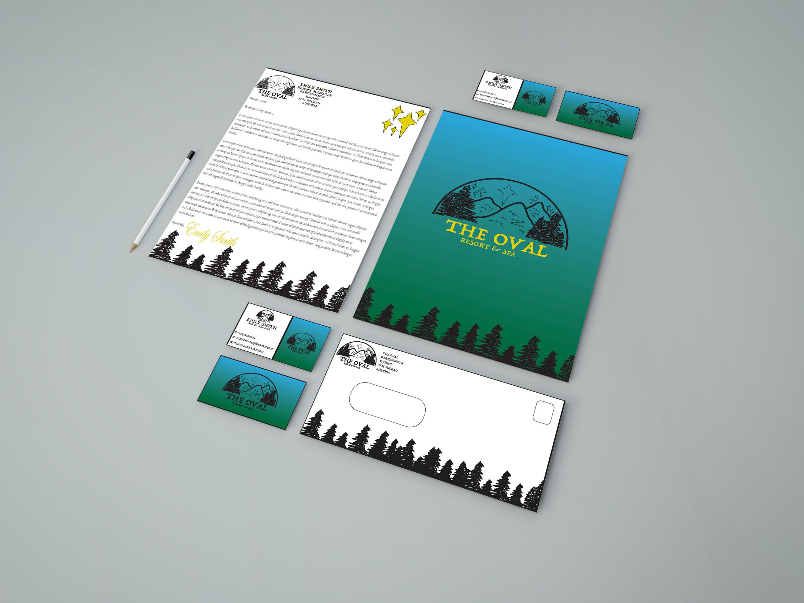
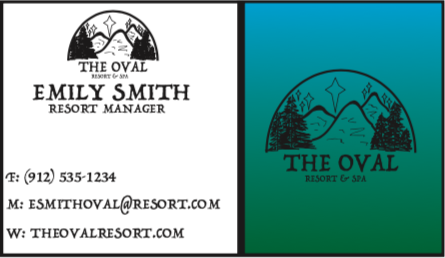
After hundreds of sketches and design development, I created traditional brand assets including a letterhead with back and front, business cards, and an envelope.
TUSCALOOSA ANGELS
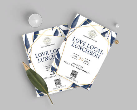
Tuscaloosa Angels is a part of National Angels, a non-profit organization. They offer support through intentional giving, mentorship and relationship building for children, youth and families in the foster care.
As a group of three, we developed several pieces, including social media calendar, to help their social media accounts to be more up to date and their posts distributed equally throughout the week. We also developed invitation and a press release for their upcoming even “Love Local Luncheon.” We kept the design simple yet informing, bringing blue tones to show trust, loyalty and inspiration. Along with “Love Local Luncheon” event invitation we created a press release for the event to reach out and inform more people in the local region.
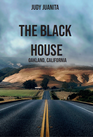
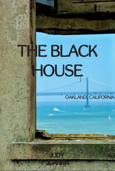
BOOK AND MOVIE COVERS
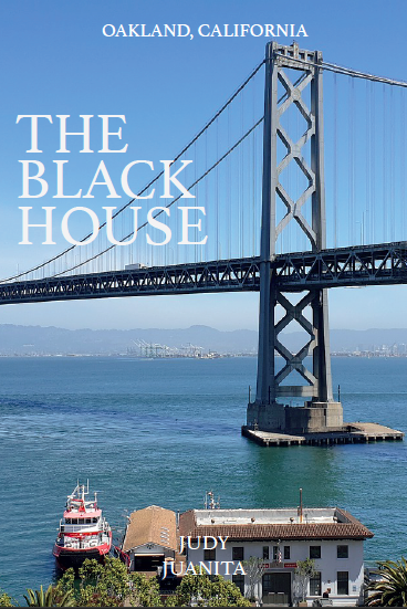
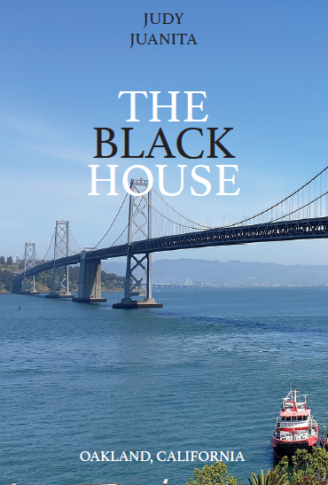
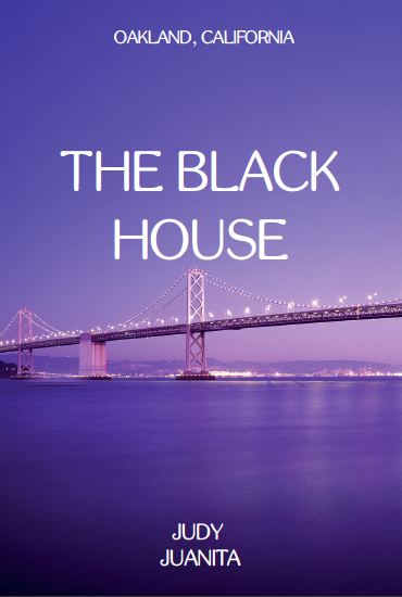
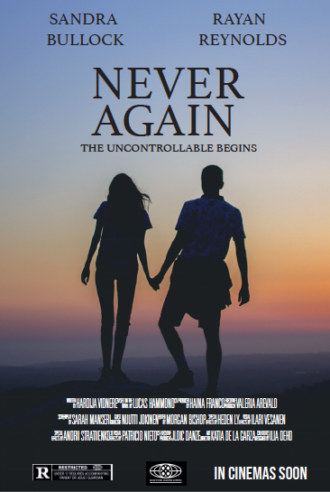
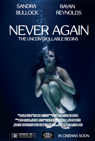
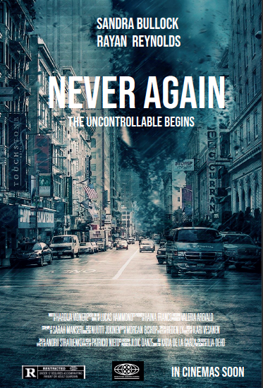
COVID-19 POSTERS
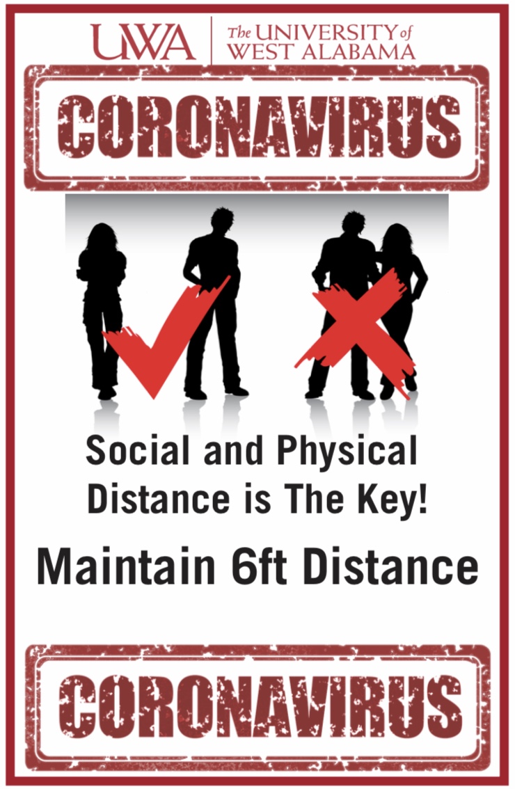
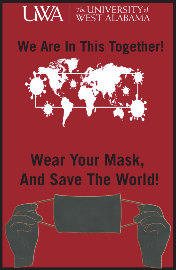
During the year of 2020, when the shocking lung disease virus developed into a serious pandemic. A lot of institutions were in need of alert posters, and so was University of West Alabama.
I created two posters with different designs and meanings. For my first poster (to the right) I came up with a simple design to follow universities guidelines and maintain 6ft distance. For the second poster (to the left), I tried more encouraging design, both verbally and visually. Since UWA colors are red, white and black, they very neatly fit with this project as red is associated with danger and effectively grabs readers attention.
THE OVAL PROJECT
Branding Project
This was a project based on a random word generator. I picked a word ‘Oval’, which I then had to develop into a company. My first two ideas were Resort & Spa as well as Dentistry Clinic (you can see some logo sketches under my Drawing/Sketching Page).
The idea of this company is cool tones, snow on mountains, hot chocolate time for families with kids. Located in Eastern Europe, nearby Austria and Switzerland.
After hundreds of sketches and design development, I created traditional brand assets including a letterhead with back and front, business cards, and an envelope.
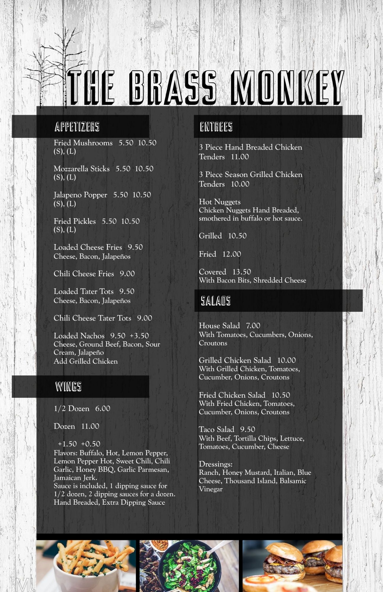
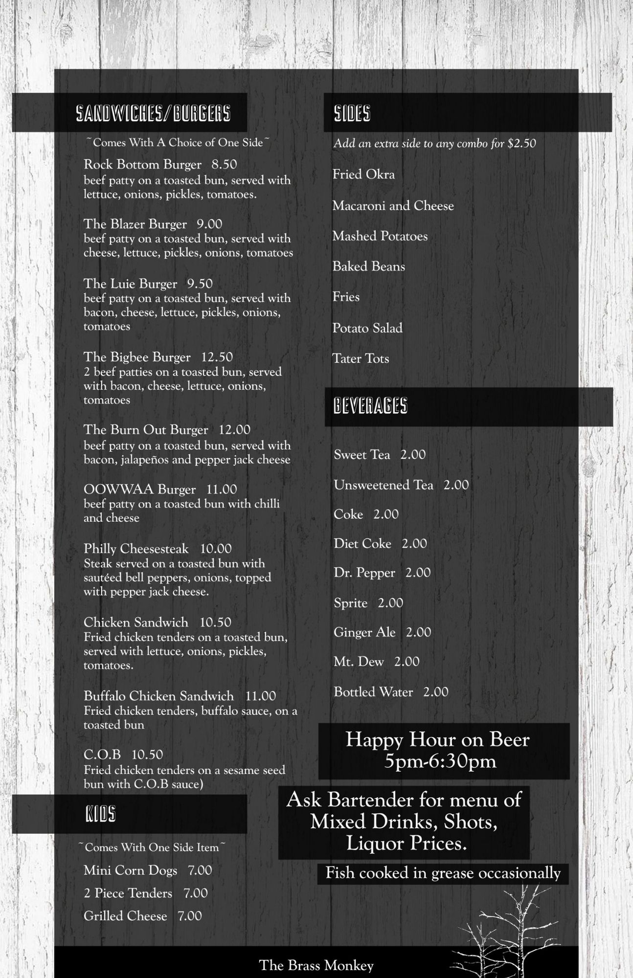
The Brass Menu Development
This was a project where I had to recreate and develop a menu for a restaurant and bar located nearby University of West Alabama, called The Brass Monkey.
Since this restaurant has a lot of sections and food/drink options, I chose to go for a standard, vertical, 11×17 poster size. For the design part, I wanted to create a welcoming, homey style, so the customers would feel comfortable and just like home. I added a small design element of birch with a wooden background to create the atmosphere I was going for.
I kept simple, complementary colors of white, black and gray. And from the wooden effect I wanted to add some textural elements to add that extra homey and cozy feeling for the visitors.
